
Visit the old website: |
Suzuki Hayabusa Stuff: 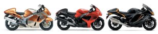 Tech Specifications Tech Specifications Color Schemes |
Featured story lines: LAMS and Commuter motorcycles Motorcycle Picture Galleries Motorcycle Specs and Pricing |
December 2007 – 2nd Gen Suzuki Hayabusa long term review – Part 1
 Here’s my the start of my long term 2nd Generation Hayabusa review (2008 onwards) . It’s been awhile since I have had to write up a Hayabusa review and it feels odd yet familiar! Ride report, review and comparison to the original Hayabusa to follow since my new 2008 Hayabusa is still being run in. This is the stationary experience see the following pages for the first ride report.
Overall the new Hayabusa does not look all that different from the last model. It certainly does not have the wow factor like the original. Side by side the original model is definitely a classic. It’s lines are simple and pure. The original designers didn’t really care how it looked to the public all that mattered was that its shape was aerodynamic enough to break 300kph.

The 2008 model’s lines are fussy in comparison to the original and the decals likewise. Of note the crescent/pod like front indicators. Perhaps its the conservative colour scheme detracts from the physical design. The filigree design like the foot pegs, especially the rear set are an interesting touch but does not present the image of speed like the original’s aero wing like extensions.
The rear end in the flesh is not as weird as the photos suggest. When viewed as a whole it actually works. Side by side the original’s rear design is honestly odd by comparison. That didn’t occur to me until I saw the two treatments. The bulges on the rear and front that house the indicators are not part of the main fairing but are actually pods that can be removed. They are put together very well so they look like they are all one piece. This would also explain reports that this model was going to have an adaptive fairing.
What is actually really odd is the design of the pipes, in particular chrome ends on the exhaust pipes. I commend the redesign of the pipes themselves purely because its different. Nevertheless the black coating looks OK (which you can still see the stainless steel braiding) if you take into account that its the same colour as the frame. Thanks to noise legislation I can understand why the new Hayabusa’s cans are huge but still…
I am not completely happy with the new Hayabusa instrument panel design. Yes it’s all new and yes it shows more things and yes green, yellow, red and blue warning lights, graphics but the raised bezels and flat plastic windows looks cheaper than the original. The Hayabusa is a top range motorcycle and it should have a bespoke instrument panel. After all the original had one that was classier than the rest…
More to the point it has whole lot more functions than the original. Almost all useful! New for ’08 is dash light brightness control, a gear indicator, a power mode indicator, a programmable rev ‘limit’ light and 2 trip meters. So they seem to have catered for the drag racers, track day riders and the tourers! The only thing I wished they included was a outside temperature gauge. *Update it is missing the fuel computer! I really like that feature on the original.

Here’s a close up of the power mode switch. Not much to look at but its effect is noticeable. 3 different power modes which makes the Hayabusa suitable for even the less experienced? According to the manual the power modes make significant differences – BUT I have only used the A mode so far.
Quality of the plastics is the similar to the original but the garnish panels on the side of the dash appear less sturdy? Back to the dash plastics, the new Hayabusa has a 4 piece dashboard surround whereas the original had only 2. I prefer the original Hayabusa – only because the textured original it looks better.
Paint work on me new one is nice and glossy – more so than the original. Less attractive where the decals which did I feel adds to its appearance. Since the decals extend to the fuel tank and is covered by the clear coat it will be hard to change graphics colors or remove them all together. (I have a Blue one)
The rear hump is smaller the the original and so is the rear seat pad. They have now included body colored passenger grab rail as opposed to the grey originals. The hump is not as obvious as the original Hayabusa. Also of note was the rear view mirrors. They are the same as the original!
Ride position is very similar to the original for me others claimed it was more up right. I think its more leant over. The feel was like the original but to me seemed more solid. Engine noise was the familiar Suzuki bag of bolts and the exhaust a more car like than before in the open the engine noise is quieter than the original.
While it looks good so far I am not as impressed with the 2008 Hayabusa as I was with the original which I bought the after the the first showing. The new model is a lovely bike but I wish they had done less physical ‘improvements’. They should have kept the fairing but redesigned the rear end and with the saved funds spent more on the dash board (eg. added a larger LCD panel) and engine.
All that said I did finally buy one!

This picture at the top is the new SAIS key you get when you buy a Hayabusa, much nicer than the old style floppy key! The picture is cut off for security reasons. That’s a Ltd Edition Tomb Raider key chain for those who are curious.
Hoped you like the first part of my new long term review!